Mini-Projects
Background Readings
The first two articles access Perusall via our course Moodle page
- Critical disability studies terminology: A list of key terms found in critical disability studies.
- Producing disability-inclusive data: Why it matters and what it takes: This article discusses data ethics issues of disability inclusion ressearch.
- (Optional) Alice Wong. 2020. Disability Visibility: First-Person Stories from the Twenty-First Century.
Mini-Project 1
Due Monday 9/30 at 9pm.
Basic outline
Your project will create two non-redundant data visualizations by each person using the travel dataset in the data folder. Each project needs to generate at least two types of graphs including bar graph, histogram, boxplot, and scatterplot, etc. You and your partner will then write up your findings in a short data-driven article of no more than 900 words. Your deliverable will be written in Quarto.
Background reading
The transport system is a pillar for ensuring social equity (Pagliara & Di Ciommo, 2020). People often need to travel to work, study, connect with other people, shop groceries, attend medical appointments, and participate in fun events. There have been uneven distributions of travel resources in the current built evnrionment for disabled people, which casue barriers to access for them (Levine & Karner, 2023). The built environment needs to be more inclusive, so disabled people can travel more easily and freely and disability can be shown as human diversity (Levine & Karner, 2023). Read Transportation patterns demonstrate inequalities in community participation for working-age Americans with disabilities (access Perusall via our course Moodle page) to learn how the National Household Travel Survey (NHTS) data can be used to study inequality and economic and social participation from a critical disability lens and provide policy implications of building a more equitable and inclusive transport system. You only need to focus on the qualitative part of this paper and please be creative in conducting your own analysis!
Guided reading questions (Please take some notes while reading)
- What are some travel patterns of disabled people?
- Be creative! What variables/research questions can you examine using the travel dataset?
- What are some policy implications of making transportation more accessible and improving disabled people's community participation?
Datasets
Conducted by the Federal Highway Administration, the National Household Travel Survey (NHTS) is the authoritative source on the travel behavior of the American public. It is the only source of national data that allows one to analyze trends in personal and household travel. It includes daily non-commercial travel by all modes, including characteristics of the people traveling, their household, and their vehicles.
I have constructed the travel dataset from the 2017 NHTS data. This dataset focuses on travel behaviors by length of disability and other demographic information. The NHTS asks respondents whether they have a medical condition "that makes it difficult to travel outside of home". Those who respond yes are defined to have a travel disability in this project.
Before producing your analysis, you will study the NHTS_OUR_DATASET_CODEBOOK in the GitHub repo to select variables for your analysis. To help you make sense of the travel dataset, I will note that the unit of observation in this dataset is a person. You can review the user guide and the original codebook in the GitHub repo to understand the context of the data.
Getting started
- Find your group in the
#in-class-discussionsSlack channel. Please identify:- Your group number.
- Who your group leader is.
- Click this link to accept this assignment in our Github classroom, please strictly enter MP1-Section(S1 or S2)-Group(your group number) (if you find that your group has been created, join your group). Then a private repository for your group will be automatically created. It might take a few minutes.
Suggestions
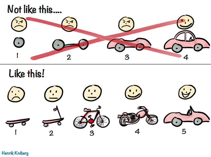
- Complete your minimally viable product (MVP)! When working on any project
- Don’t try to do everything completely and perfectly from the beginning. This leads to perfectionist thinking, which leads to procrastination and “analysis paralysis.”
- Do start by finishing a MVP. In other words:
- Once you’re done your MVP, gather feedback on how your project works. Based on this feedback, then iterate and improve.
- You don't need to do data wrangling for this project.
- Here is a randomly chosen example to give a qualitative sense of the outcome.
Submitting the assignment
- Push all changes to GitHub. You don't need to submit anything on Moodle.
- Both group members: Fill out the peer evaluation Google Form.
Disclaimer
The travel dataset used in this project are a subset of the NHTS data and unweighted. The results of your analyses cannot be generalized beyond the samples collected in this dataset.
Assessment
You will be evaluated on the extent to which your mini-project demonstrates fluency in the following standards:
- Do you use visual cues effectively on the plots?
- Are the values on your plots legible and clear?
- Are all visualizations mindful of the data-ink ratio?
- Do all visualizations have appropriately labeled axes, legends, titles, etc.?
- Do your labels and titles accurately identify each row your data presents, variables, filters, geographic context, and temporal context?
- Are your axes set to an appropriate scale?
- Have you selected appropriate plots based on the variable types presented in the dataset?
- Have you created two non-redundant data visualizations by each person?
- Has your project generated at least two types of graphs including bar graph, histogram, boxplot, and scatterplot, etc.?
- Have you customized the plots, making use of two available geoms and/or color palettes?
- Have you interpreted the data visualizations?
- Does your interpretation detail each row your data presents?
- Does your interpretation detail how the values in the variables you selected were measured?
- Have you successfully followed the workflow, including cloning repositories, committing, pulling, pushing, and resolving simple merge conflicts if any?
- Have you successfully formatted the report in Quarto as we discuss in class?
- Have you successfully authored the report in Quarto so that the final submission is production-quality, replete with data graphics and correct spelling and grammar?
- Have you explicitly stated your research question motivating your analysis?
- Does written text make a logical argument supported by your data analysis and communicate your findings effectively? From the report reader’s perspective, there should be no “superfluous” and non-informative output (e.g. instructions text).
- Are all accompanying write-ups are coherent and respect the word count limit?
- Have you included citations (if any) as footnotes?
- Have you cited AI-generated content if you get help with your programming tasks?
- Is your code clean, commented, and well-indented?
- Have you included at least one ethical concern in your joint reflection?
- Have you included what you have learned from the assigned disability inclusion readings in your report and at least one policy implication for disabled people from the results of your data analysis?
Mini-Project 2
Due Friday 11/8 at 9pm.
Basic outline
Your project will wrangle the Current Population Survey (CPS) datasets in order to reveal two findings about topics including but not limited to disability, labor force status, and income. You need to join at least two datasets, tidy data, subset, aggregate, and summarize data as necessary, create at least one graph, and write one function. You and your partner will then write up your findings in a short data-driven article of no more than 700 words. Your deliverable will be written in Quarto.
Background reading
The unemployment rate of disabled people is higher than their nondisabled counterparts. However, a single measurement of unemployment rate may have limitations (Brucker et al., 2018; Sylla, 2013). One limitation is that it excludes persons not in the labor force who are interested in work (Sylla, 2013). A 2015 survey showed that disabled people are interested in and actively looking for jobs (Kessler Foundation, 2015). Thus, high levels of unemployment rate for disabled population may send the wrong signal to policymakers about the inactivity and interests of them (Brucker et al., 2018). The other limitation is that it may disguise high levels of poverty (Brucker et al., 2018; Sylla, 2013). Some people who are in the labor force do not have a significantly different situation from those who are unemployed in terms of actual activity and income (Sylla, 2013). On the other hand, due to health issues, people may participate in income maintenance programs, such as Social Security Disability Insurance and Supplemental Security Income (Brucker et al., 2015).
This project is trying to provide a broader range of measurements to look at disability, labor force status, and income, etc. as well as the intersection of disability, gender, race, and other demographic characteristics. Read Linking public housing employment and disability benefits for working age people with disabilities (access Perusall via our course Moodle page) to learn how the Current Population Survey (CPS) data can be used to study employment, disability benefits, disability type and provide relevant policy implications. This paper has a focus on public housing and disability benefits. You can explore other aspects of disability and/or employment. Please be creative in generating your research questions and creating your story!
Guided reading questions (Please take some notes while reading)
- What are some barriers you are aware of that disabled people face regarding employment?
- What are the relationships among employment rate, disability benefits, and types of disability based on the article?
- What are some strategies for hiring, advancing, and retaining disabled employees?
Datasets
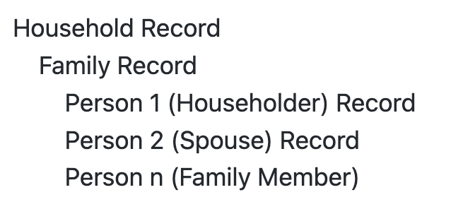
The CPS is the source of the official Government statistics on employment and unemployment. The CPS has been conducted monthly for over 50 years. Currently, about 54,000 households are interviewed monthly, scientifically selected on the basis of area of residence to represent the nation as a whole, individual states, and other specified areas. Each household is interviewed once a month for four consecutive months one year, and again for the corresponding time period a year later. The CPS-Annual Social and Economic (ASEC) Supplement data provides the usual monthly labor force data. The ASEC includes a household record, a family record, and a person record.
I have constructed the house, family, and person datasets from the 2022 CPS-ASEC data. To help you make sense of these datasets, I will note that the unit of observation in the house dataset is a household, that in the family dataset is a family, that in the person dataset is a person. The relationship among the three datasets is illustrated below:
You need to use at least two of the three datasets. Before producing your analysis, you will study the CPS_OUR_DATASET_CODEBOOK in the GitHub repo to select variables for your analysis and learn how to join these datasets.
Getting started
- Find your group in the
#in-class-discussionschannel. Please identify:- Your group number.
- Who your group leader is.
- Click this link to accept this assignment in our Github classroom, please strictly enter MP2-Section(S1 or S2)-Group(your group number) (if you find that your group has been created, join your group). Then a private repository for your group will be automatically created. It might take a few minutes.
Suggestions
- Start off simple, producing an analysis that just touches the surface of the question. You can layer in more complicated analysis as you go along. Remember minimally viable product!
Submitting the assignment
- Push all changes to GitHub. You don't need to submit anything on Moodle.
- Both group members: Fill out the peer evaluation Google Form.
Disclaimer
The datasets used in this project are subsets of the CPS-ASEC data and unweighted. The results of your analyses cannot be generalized beyond the samples collected in these datasets.
Assessment
You will be evaluated on the extent to which your mini-project demonstrates fluency in the following standards:
- Have you used the
select()orfilter()function to effectively subset the data? - Have you used the
group_by()function in combination with other data wrangling verbs to effectively aggregate the data?
- Have you effectively joined at least two data frames?
- Have you effectively transformed datasets into new formats (longer or wider) in order to prepare them for further analysis or visualization?
- Have you effectively written a function?
- Have you successfully followed the workflow, including cloning repositories, committing, pulling, pushing, and created branches if needed?
- Have you successfully formatted the report in Quarto as we discuss in class?
- Have you successfully authored the report in Quarto so that the final submission is production-quality, replete with data tables and/or graphics, and correct spelling and grammar?
- Have you explicitly stated your research question motivating your analysis?
- Does written text make a logical argument supported by your data analysis and communicate your findings effectively?
- Are all accompanying write-ups are coherent and respect the word count limit?
- Have you included citations as footnotes?
- Have you cited AI-generated content if you get help with your programming tasks?
- Have you used descriptive variable names?
- Is your code clean, commented, and well-indented?
- Have you included at least one ethical concern in your summary?
- Have you included what you have learned from the assigned disability inclusion readings in your report and at least one policy implication for disabled people from the results of your data analysis?
- Do you use visual cues effectively on the plots?
- Are the values on your plots legible and clear?
- Are all visualizations mindful of the data-ink ratio?
- Do all visualizations have appropriately labeled axes, legends, titles, etc.?
- Do your labels and titles accurately identify each row your data presents, variables, filters, geographic context, and temporal context?
- Are your axes set to an appropriate scale?
- Have you selected appropriate plots based on the variable types presented in the dataset?
- Have you interpreted the data visualizations?
- Does your interpretation detail each row your data presents?
- Does your interpretation detail how the values in the variables you selected were measured?
Mini-Project 3
Due Wednesday 12/18 at 2pm.
Basic outline
Your project will create at least one static map using the ggplot2 package and at least one interactive map using the leaflet package. Among your static and interactive maps, at least one of them must be a choropleth map. You and your partner will craft a short data-driven article of no more than 750 words. Your deliverable will be written in Quarto.
Background reading
Take a look at some examples of distributions of disability characteristics across the US. (access Perusall via our course Moodle page)
Guided reading questions (Please take some notes while reading)
- What research questions can you examine using the person_house_map dataset and/or
tidycensuspackage after reading this article? - How do we use data to tell a story of disabled people?
Datasets
You and your partner will use one or several of the following datasets.
- The CPS person_house_map dataset in the data folder: This is similar to the datasets used in MP2. I have constructed this dataset by joining the house and person datasets and adding location information. You need to first convert this dataframe to an
sfobject. - US census data--disability related variables (combined with other variables) using the
tidycensuspackage as we did in Lec 32 In-class Exercise. - At least one of the above two datasets must be used in your project. You're welcome to use/join other datasets to enrich your analysis.
Getting started
- Form your group of 2-3 students. Once you all agree to be in the same group, one student from your group helps send all of your group members' names to me via Slack by 9pm this Saturday (11/30). If you don't send me your group by that time or don't have any preference, I'll assign you to groups.
- I'll post MP3 groups in the
#in-class-discussionschannel next Monday morning (12/2). - After that, click this link to accept this assignment in our Github classroom, please strictly enter MP3-Section(S1 or S2)-Group(your group number) (if you find that your group has been created, join your group). Then a private repository for your group will be automatically created. It might take a few minutes.
Suggestions
- Map making can get very complicated, so start simple. Get that minimally viable first visualization done, then iteratively add complexity.
- Here are two randomly chosen examples to give a qualitative sense of the outcome.
Submitting the assignment
- Push all changes to GitHub. You don't need to submit anything on Moodle.
- Both group members: Fill out the peer evaluation Google Form.
Disclaimer
The dataset used in this project is a subset of the CPS-ASEC data and unweighted. The results of your analyses cannot be generalized beyond the samples collected in the dataset.
Assessment
You will be evaluated on the extent to which your mini-project demonstrates fluency in the following standards:
- Have you successfully acquired your data and converted them to desired objects and/or correctly loaded them into R?
- Have you created at least one static map?
- Have you created at least one interactive map?
- Among your static and interactive maps, have you created at least one choropleth map?
- Wherever possible, have all maps appropriately labeled axes, legends, and titles and all maps are mindful of the data-ink ratio?
- Have you demonstrated effective binning when coloring maps?
- Have your static map and interactive map produced a cohesive and in-depth story?
- Have you successfully followed the workflow, including cloning repositories, committing, pulling, pushing, and created branches if needed?
- Have you successfully formatted the report in Quarto as we discuss in class?
- Have you successfully authored the report in Quarto so that the final submission is production-quality, replete with maps, and correct spelling and grammar?
- Have you explicitly stated your research question motivating your analysis?
- Does written text make a logical argument supported by your data analysis and communicate your finding effectively?
- Are all accompanying write-ups are coherent and respect the word count limit?
- Have you included citations as footnotes?
- Have you cited AI-generated content if you get help with your programming tasks?
- Is your code is clean, commented, and well-indented?
- Have you included at least one ethical concern in your summary?
- Have you included what you have learned from the assigned disability inclusion readings in your report and at least one policy implication for disabled people from the results of your data analysis?